Home
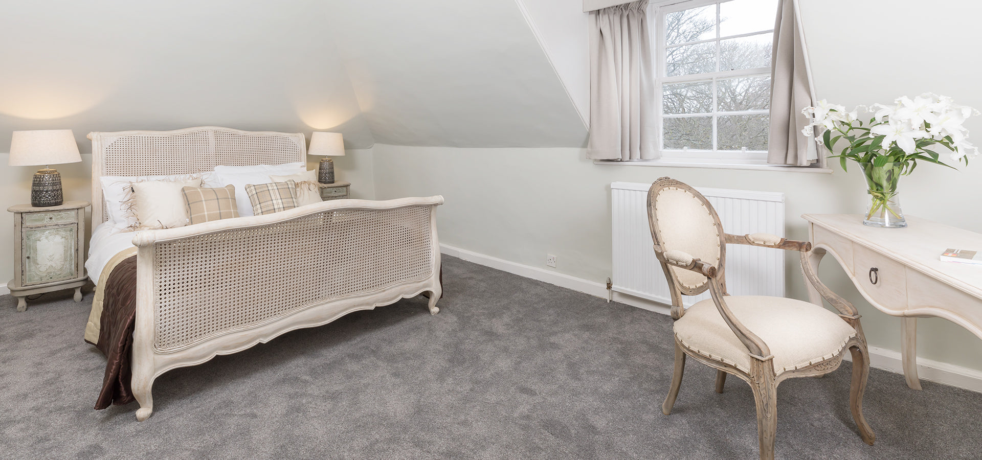
Three Sneaky Storage

31-Jul-2019
Three Sneaky Storage
Grid classes apply to devices with screen widths greater than or equal to the breakpoint sizes, and override grid classes targeted at smaller devices. Therefore, e.g. applying any .col-md-* class to an element will not only affect its styling on.
Lorem Ipsum is simply dummy text of the printing and typesetting industry. Lorem Ipsum has been.
Join 241,000 customer-obsessed readers on our mailing list.
Get The Latest Updates Of Our Members Thoughtbox.
Related Blogs

An Organized Multi-Use Rooms
Lorem Ipsum is simply dummy text of the printing and typesetting industry. Lorem Ipsum has been.
Read the article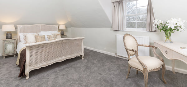
Guide To Getting Organized Rooms
Lorem Ipsum is simply dummy text of the printing and typesetting industry. Lorem Ipsum has been.
Read the article
Three Sneaky Storage
Lorem Ipsum is simply dummy text of the printing and typesetting industry. Lorem Ipsum has been.
Read the article0 comments
Leave A Reply
Recent Posts

Guide To Getting Organized...
Lorem Ipsum is simply dummy text of the printing and...
Jul 31, 2019 0